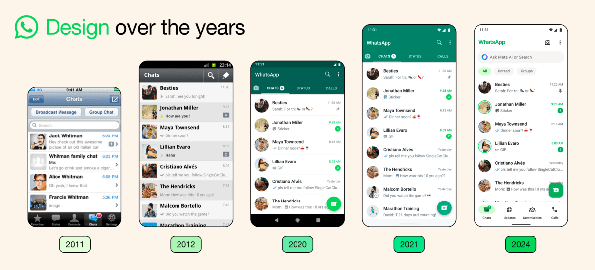
WhatsApp is updating its mobile apps for a fresh and more streamlined look, while also introducing a new “darker dark mode,” the company announced on Thursday. The messaging app says that over the years, it has primarily focused on adding utility to the app and that while the product continues to grow, its design needs […]
© 2024 TechCrunch. All rights reserved. For personal use only.
WhatsApp is updating its mobile apps for a fresh and more streamlined look, while also introducing a new “darker dark mode,” the company announced on Thursday. The messaging app says that over the years, it has primarily focused on adding utility to the app and that while the product continues to grow, its design needs to evolve as well.
The messaging app is introducing a new color palette after considering over 35 different colors. WhatsApp focused on deeper tones to reduce eye strain in low-light situations. The app’s dark mode, a popular option for many people, is now one shade darker to make it easier to read messages.
Image Credits: WhatsApp
WhatsApp is adding a native bottom navigation bar on Android to make it easier for users to find what they’re looking for quickly. The new navigation bar, which has been available on iOS for quite some time now, lets you quickly look at your chats, updates, communities, and calls.
As for iOS users, WhatsApp is making it easier to send photos and videos thanks to a new attachment layout. Instead of a full-screen menu, users will now see an expandable tray that allows them to see the options more clearly when sending media, polls, documents, and more.
WhatsApp is also updating its icons to a rounded, outlined style. Plus, the app is refreshing the default background in chats.

Leave a Reply